Tuesday, April 26, 2011

Final Project-Graduation Invitation

For this project we were to use an element that needed to be folded.  I decided to go with a graduation announcement for the high school I went to (Pittsburg High School).  The document will fold twice and is 11.5 inches in height and 6.5 inches in width.  It will fold first at 8.125 inches and then again at 3.5 inches.  There will also be a metallic strip on the outside of the first fold.  There will also be two elements that would need to be embossed. I decided to do a graduation announcement because when I graduated high school I absolutely loved the one we chose and I would like to create something that would express my personality as well as the school I attended.  The target audience for this project are seniors that attend Pittsburg High School.  The only specifications we had for this project was to have an element that folded and I did that.

My call to action is to get these senior students and their parents to purchase these announcements and then send them to their respected families and friends.  Overall I am happy with how my invitations turned out as always now that I have the printed piece in front of me I see things that I could have made better but not big things.  If I were to get this exact invitation mass produced to 500 it would cost me around $224.07.  And that is for a 2 color job printed on the front and the back.  I believe my invitation turned out well and am happy with the results.

Thumbnails/Roughs/Final Piece:


Wednesday, April 6, 2011

The Good and the Bad

As a homework assignment we were to go around town, grocery store or wherever and find designs that we did and didn't like and why.  Below are some of the designs I found.


This is such a boring design for a package, and the entire Always Save brand's packaging looks this terrible.  It very dull and not eye catching in any way, shape or form.  It's a good thing there prices are extremely low or else they would never sell anything if it was based on design alone.


Kraft Macaroni and Cheese recently changed there logo not too long ago and I do actually like it.  They stuck with there original color scheme but changed the logo element and picture they use.  I think the new pictures really invites people to want to try the product if they already haven't.  And since Kraft likes to promote children with this product I think its way more kid friendly than there more boring older design.  Click here to check out the old packaging.

Publication Ad

For our next assignment we are to create a full page ad for a magazine of our choice.  With this we have to find the actual page specifications that this magazine uses and apply it to our ad.  My magazine of choice was my favorite Cosmopolitan Magazine and to see the page specifications for there ads click here.

My inspiration for this ad was make up, as I was looking through my current issue of Cosmopolitan I noticed a lot of make up ads and wanted to design something that would work in this magazine but with a twist.  I created my own make-up company called "Destiny Make-up".  I decided to do half duo-tone because I wanted to give the ad an edgy vibe and I think that it worked.  The two sides I was going with was a very edgy unique person who is also vibrant and beautiful with "Destiny Make-up on.

Thumbnails/Roughs:


Sunday, April 3, 2011

New and Improved Starbucks Logo

To celebrate there 40 year anniversary the people at Starbucks decided to change there logo.  The new logo is simple and elegant which gives the Siren a new look, the Siren reflects romance and creativity which inspired those who founded Starbucks 40 years ago.  The main component to changing the logo dealt with the typeface, color, shape and the Siren herself.  They realized that keeping things simple would bring the energy of the Siren to life.  They took out the words, brightened the green, and took the Siren of the ring she was in. 

"For forty years she’s represented coffee, and now she is the star," said Mike P. senior creative director of Starbucks.  Other things they did to the logo was improve composition, used a more sophisticated stroke and spacing.  For the Siren they smooth her hair, and refined her facial features.

I personally prefer the new Starbucks logo, it gives off a new more simple vibe to the Starbucks brand.  If someone asked me before the new logo was made I would have told them the logo looked fine the way it was and no changes were necessary.  But now I like it so much better without the words and love the fact that is all green.  A definite much better way of expressing their brand.

Thursday, March 31, 2011

Newspaper Ad

Target Audience: the target audience for this is ad is 25-60 year olds who shop at Ron's Supermarket in the morning probably sometime before 11 o clock.  This includes males or females and any parents who take there children to the store with them. 

Call to Action: my call to action would be for them to buy biscuits and gravy from the bakery/deli department while they continue there shopping experience.

I am going to create a ad for Ron's Supermarket, yesterday at work I noticed that we were going to start serving biscuits and gravy on Friday and Sunday.  I decided to create a ad promoting the new breakfast item for people in the community who otherwise may not have realized they were going to start this.

My ad is going to be 4 col inches and 6 inches in height.  With that it will be 24 inches total I will then multiply that by 4 dollars which gives me 96 dollars which is 4 dollars under my 100 budget.  And all images were made by me in either Adobe Illustrator or Adobe InDesign.

Thumbnail, Roughs and Final Image:


Thursday, March 3, 2011

Direct Mail Piece

For this direct mail piece we were to come up with a element that would target two different audiences by using the same piece.  I chose to do a restaurant that would be targeting those who ate meat and those who did not.  One of the hardest issues in starting this project was choosing which pictures went the best with each of the two pieces.  For the "carnivore" section of the project I chose to use a cheeseburger because most of us who do like to eat meat love burgers.  Also, "Roscoe's" which is what I called my restaurant is more of a burger type joint so you wouldn't want anything too fancy used in the piece.  And for the "herbivore" part of the project I just went with vegetables to get the affect that I wanted for the project.

I used the font Reporter for Roscoe's name and tagline because the font really gave it a logo element without having to really create one in either Photoshop or Illustrator.  And I used Rotis San Serif light for the rest of the body text because it was very simple and that was the look I was going for.  And then I chose a sort of burnt orange for the background on the carnivore part because it looked well along with the bun on the burger and a blue background for the herbivore section because it really made the vegetables pop out from the paper.  On both of the pieces the documents bleed on two sides, the text is white to make the words pop and both in CMYK color mode.  Also all the images on the pieces are C.O.B's that I created in Photoshop and I chose a 7x5 inch layout.


The parameters were to create a variable data piece that would target two different audiences.  You choose either from a 7x5' piece or 6x8' with a fold.


All images used were from sxc.hu and are copyright free. Click this link for copyright statement.
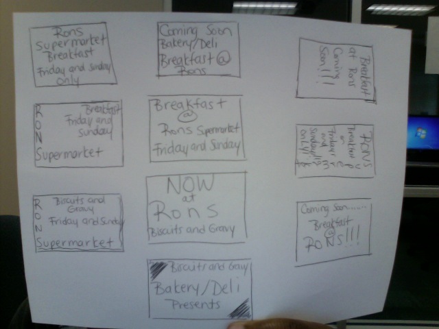


Thumbnails


Roughs: Top is the front of the Direct Mail piece and bottom is the back of the piece.


Target Audience
:  the target audience for this piece is very broad and only narrowed down to people who are omnivores and people who are herbivores.  This piece will be getting people to go to restaurant with the separate pieces targeting one of the two audiences.

Call to Action: I want the recipients to go to the restaurant of choice sit down and eat a meal from there based on the fact that they either want to eat meat or just veggies.

Monday, February 28, 2011

Self Promotional Notepad

Purpose:

This self promotional notepad is a piece in which I designed a notepad for future employers so they could first hand see some of my skills.

This notepad is 7 x 5 inches, black ink only, with no bleed.  The notepad was printed 50 pages per pad and has a chip board back.  Each pad was $1.86 each and took one business day to make and to print the pad they needed a packaged file which I did in InDesign.  Black ink was chosen because it is cheaper than a 4 color notepad would be.  I printed 3 notepad and the final price was $5.58.

Copyright Statement:
All of the the artwork was created by me in Adobe Illustrator except for the eye and it is a Adobe Photoshop brush which was downloaded from brusheezy.com. 

Inspiration:
The inspriation for my notepad was my new found skill in Illustrator.  For the longest time I struggled with the software and now I am becoming more and more comfortable with the fact that I can draw it will just take some time. The pencil in the notepad went with the doodle theme because I use a pencil to write.  The ghost was something I had recently drawn for t-shirt in my screen printing class and I was really proud of the little guy so I included him in my design.  I used the eye instead of the letter to give it more an informal theme which is what I was going for with the doodling.  I love hearts so I had to put one of those in my design, because hearts really describe me and I like to include them in designs if they fit.  And lastly I used Wiesbaden Swing as my font because it really gave the feel that I had wrote the text myself.


Tuesday, February 22, 2011

Photoshop Formats


Four color raster image | CMYK | full bleed | saved as an eps or tif file |

This image must be 300 resolution with an 1/8 inch bleed. Since this was for a 6 x 4.25 inch postcard your file size will need to be 6.25 x 4.50 to accommodate the bleed. 

Duotone Raster | full bleed | saved only as eps | duotone color mode | used Pantone 438 C and black for my duotone

This image must be 300 resolution with an 1/8 inch bleed. Since this was for a 6 x 4.25 inch postcard your file size will need to be 6.25 x 4.50 to accommodate the bleed.

Grayscale Raster | full bleed | saved as eps or tif | grayscale color mode |

This image must be 300 resolution with an 1/8 inch bleed. Since this was for a 6 x 4.25 inch postcard your file size will need to be 6.25 x 4.50 to accommodate the bleed.