Fellow Bloggers,
I have finally decided on a name for my ficticious magazine BOMBE which is the french word for bombshell. Why did I choose this you might ask? I wanted to describe females in a manner in which you don't hear very often which is why I had first went with the name Vixen. This magazine will be specifically for females included will be funny stories (confessions), stories about beauty, men among numerous other things. My first story is about 90% done and was inspired from the crazy things my friends and I have done "Classy Not Trashy" is the name of the article. I also have began on one of my one page ads and started on the back cover page as well. Hopefully, tomorrow I can put up some screen shots of my progress.

Wednesday, September 12, 2012
Tuesday, September 4, 2012
Bombe?
Fellow bloggers,
As I said in my previous post I am going to be creating a fictitious magazine to really showcase my layout skills and the things I have learned in my four years at Pitt State University. The magazine with be 8.5x11 finished, and will consist of 12 pages. When I first started planning out the magazine I was going to make it 10 pages but if you do your research you will find that is not possible because it needs to be in groups of 4 (4, 8, 12, 16 etc) because you will have two pages on the front and back.
My biggest struggle so far is the title of the magazine, because of copyright reasons I cannot name the magazine after one that is already being published (Rave, Beaute, Vixen) these were my top picks and they have been thrown into the dumpster. My choices right now that are NOT already out there are as follows:
1) Bombshell
2) Bombe
3) Fabuleux
Or....
I thought about changing the spelling on the already Vixen magazine to Vix-N but that looks a little tacky to me. So far I think option 2 will be my final choice, I will keep you posted on what I choose and next is color scheme which is always fun for me because I LOVE color. Until next time...
Happy Blogging!!!!
Tuesday, August 21, 2012
New things to come.....
Hello everyone in blogger land,
It has been ages since I have made a post I was a huge slacker!!!! I do plan on adding a lot of new things to this blog in the upcoming months. For my Senior Project I plan on creating a fictitious magazine and as I create it you will the step by step process until its fully completed!!!! Also I will be doing some work in my Document Design class as well so be looking for those things as well!!!
Happy Blogging!!!
Tuesday, April 26, 2011
Final Project-Graduation Invitation
For this project we were to use an element that needed to be folded. I decided to go with a graduation announcement for the high school I went to (Pittsburg High School). The document will fold twice and is 11.5 inches in height and 6.5 inches in width. It will fold first at 8.125 inches and then again at 3.5 inches. There will also be a metallic strip on the outside of the first fold. There will also be two elements that would need to be embossed. I decided to do a graduation announcement because when I graduated high school I absolutely loved the one we chose and I would like to create something that would express my personality as well as the school I attended. The target audience for this project are seniors that attend Pittsburg High School. The only specifications we had for this project was to have an element that folded and I did that.
My call to action is to get these senior students and their parents to purchase these announcements and then send them to their respected families and friends. Overall I am happy with how my invitations turned out as always now that I have the printed piece in front of me I see things that I could have made better but not big things. If I were to get this exact invitation mass produced to 500 it would cost me around $224.07. And that is for a 2 color job printed on the front and the back. I believe my invitation turned out well and am happy with the results.
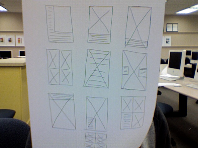
Thumbnails/Roughs/Final Piece:


My call to action is to get these senior students and their parents to purchase these announcements and then send them to their respected families and friends. Overall I am happy with how my invitations turned out as always now that I have the printed piece in front of me I see things that I could have made better but not big things. If I were to get this exact invitation mass produced to 500 it would cost me around $224.07. And that is for a 2 color job printed on the front and the back. I believe my invitation turned out well and am happy with the results.
Thumbnails/Roughs/Final Piece:


Wednesday, April 6, 2011
The Good and the Bad
As a homework assignment we were to go around town, grocery store or wherever and find designs that we did and didn't like and why. Below are some of the designs I found.


This is such a boring design for a package, and the entire Always Save brand's packaging looks this terrible. It very dull and not eye catching in any way, shape or form. It's a good thing there prices are extremely low or else they would never sell anything if it was based on design alone.
Kraft Macaroni and Cheese recently changed there logo not too long ago and I do actually like it. They stuck with there original color scheme but changed the logo element and picture they use. I think the new pictures really invites people to want to try the product if they already haven't. And since Kraft likes to promote children with this product I think its way more kid friendly than there more boring older design. Click here to check out the old packaging.
Publication Ad
For our next assignment we are to create a full page ad for a magazine of our choice. With this we have to find the actual page specifications that this magazine uses and apply it to our ad. My magazine of choice was my favorite Cosmopolitan Magazine and to see the page specifications for there ads click here.
My inspiration for this ad was make up, as I was looking through my current issue of Cosmopolitan I noticed a lot of make up ads and wanted to design something that would work in this magazine but with a twist. I created my own make-up company called "Destiny Make-up". I decided to do half duo-tone because I wanted to give the ad an edgy vibe and I think that it worked. The two sides I was going with was a very edgy unique person who is also vibrant and beautiful with "Destiny Make-up on.
Thumbnails/Roughs:


Sunday, April 3, 2011
New and Improved Starbucks Logo

"For forty years she’s represented coffee, and now she is the star," said Mike P. senior creative director of Starbucks. Other things they did to the logo was improve composition, used a more sophisticated stroke and spacing. For the Siren they smooth her hair, and refined her facial features.
I personally prefer the new Starbucks logo, it gives off a new more simple vibe to the Starbucks brand. If someone asked me before the new logo was made I would have told them the logo looked fine the way it was and no changes were necessary. But now I like it so much better without the words and love the fact that is all green. A definite much better way of expressing their brand.
Subscribe to:
Comments (Atom)